Tell your local Habitat’s story.
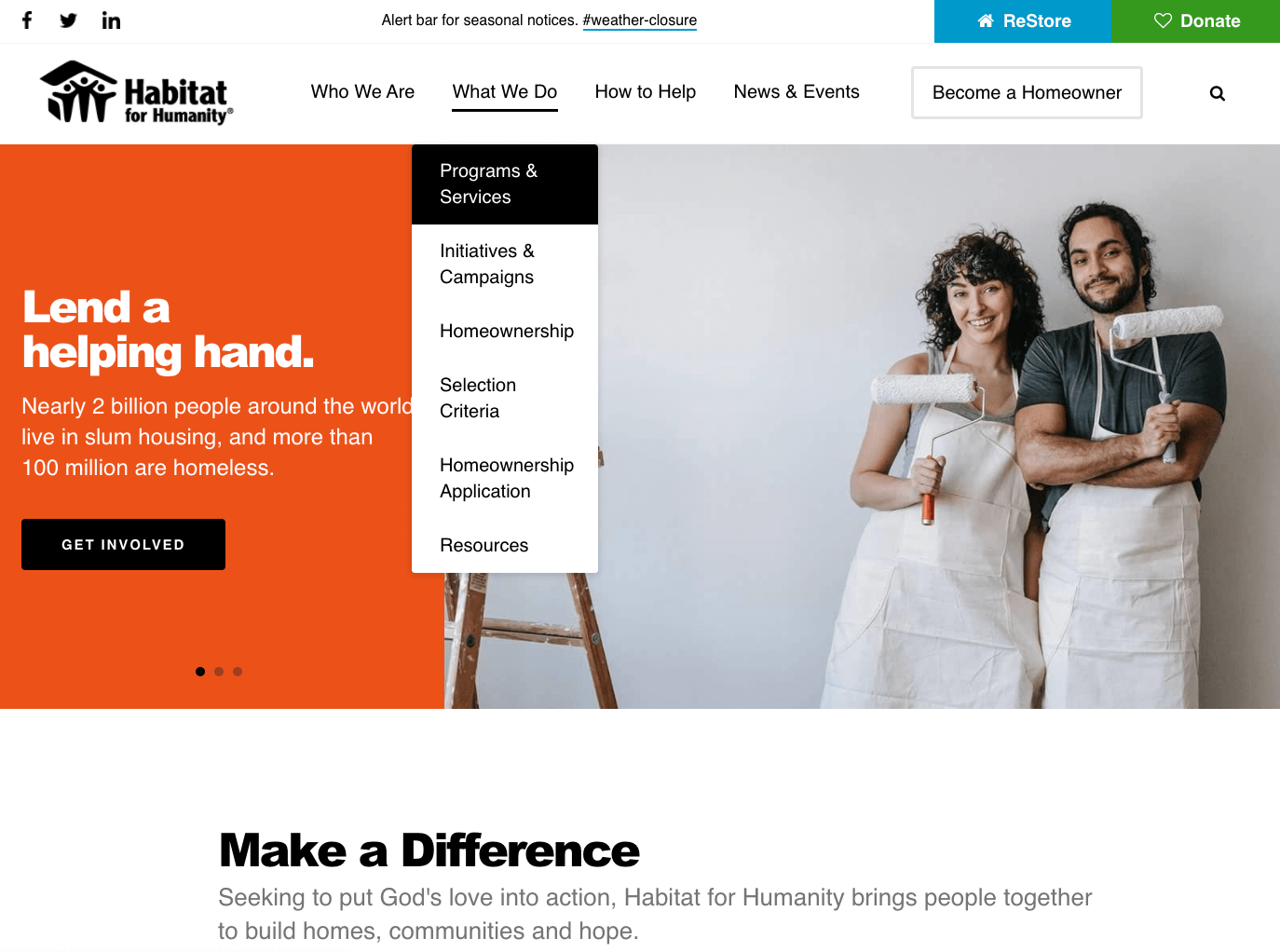
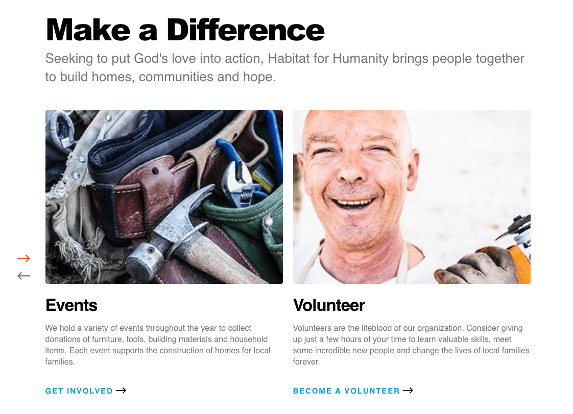
This website’s homepage design opens up with a large, full-color image slideshow that highlights the stories, events and volunteer opportunities you want your visitors to know. The dynamic, geometric design conserves space so you can efficiently present information.
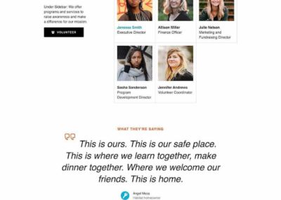
As you scroll down the homepage, we also have unique design elements for testimonials and blog links to make them stand out and maximize readability. Everything is optimized for you to communicate your Habitat’s story right away.
Engage with families, volunteers and builders.
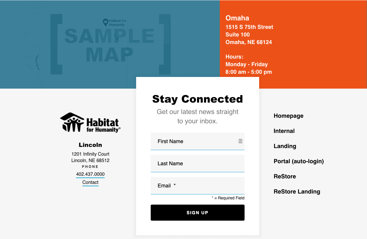
The communication features of this site make it easier than ever to connect with families and strengthen your volunteer base. All social media links are located at the top left for visibility. An email signup form is prominently displayed on the homepage to build your email list.
Super user friendly? Absolutely.
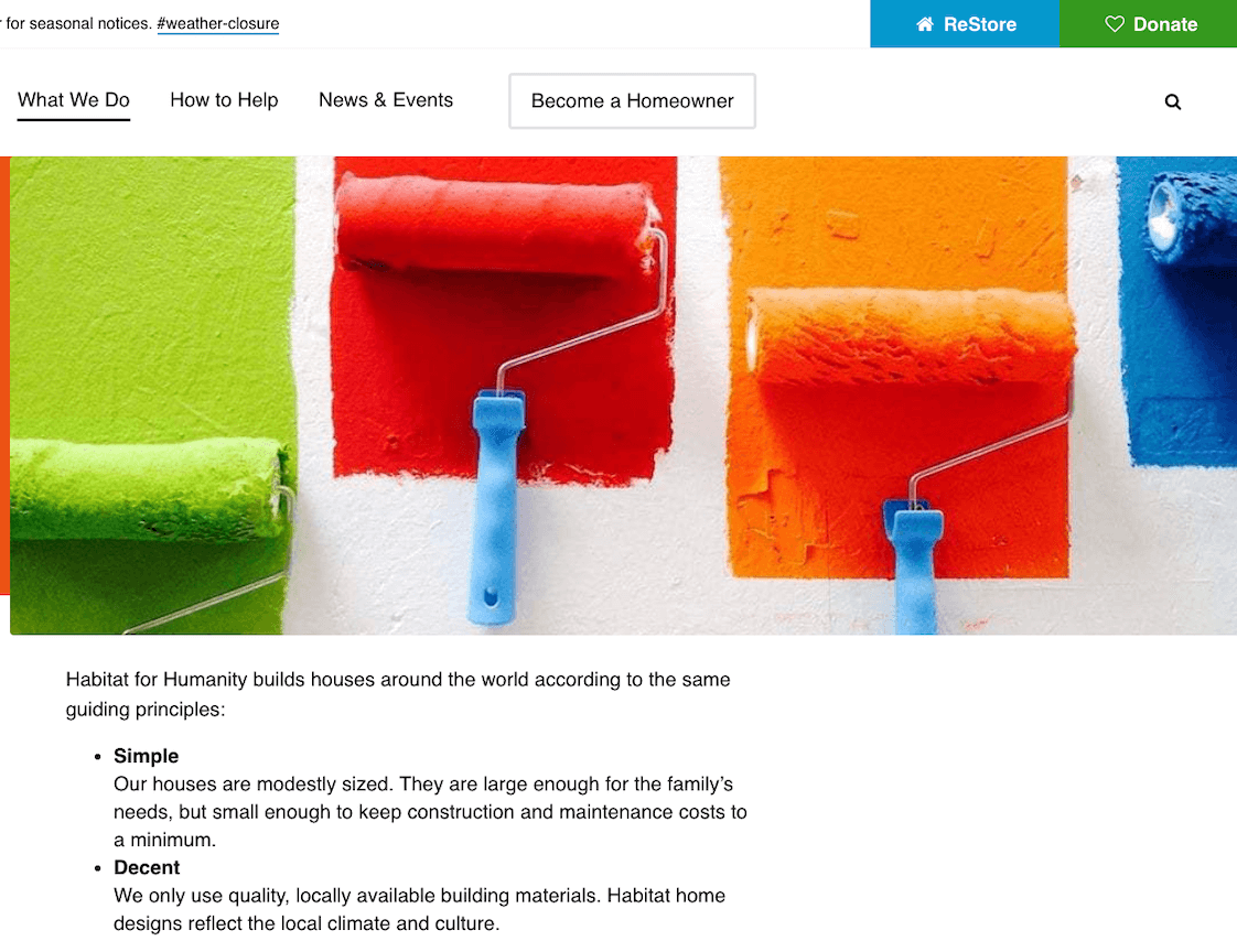
No matter what your website visitors are looking for, they’ll find it easily with Firespring’s user-friendly layout. This site has eye-catching quick links to your most important pages like “Become a Homeowner” and “ReStore.” The site’s footer also contains all the most highly trafficked page links, so navigation is easy from anywhere on a page.
Your visitors will find the exact information they need in no time, so they can start volunteering or finding a home even quicker.
Boost your donations.
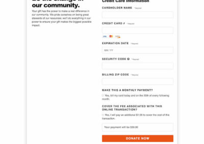
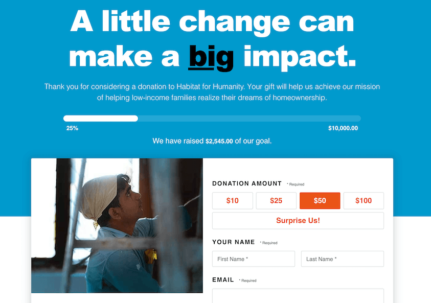
We’ve placed prominent buttons linking to the ReStore and donation pages right at the top of the homepage. Supporting your local Habitat should be as simple as possible, so we made giving one of the core focuses of the site design. You can also honor your sponsors on your homepage with a carousel of their logos and pictures.
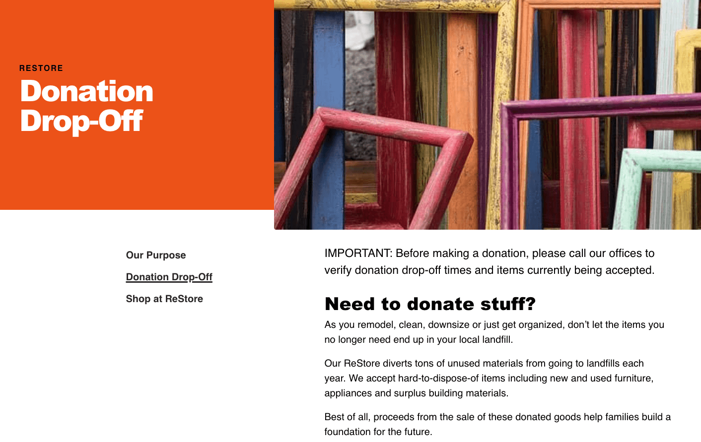
Make your ReStore shine.
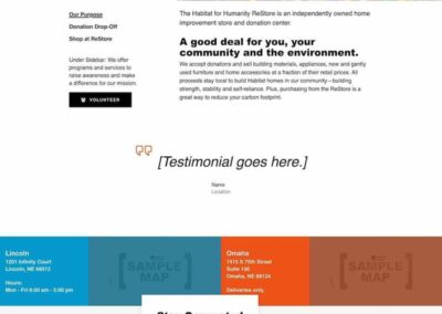
Each ReStore purchase and donation helps your team create housing for those who need it most. Your ReStore is for everyone in your community, so make it shine with the help of our design. We made the navigation from your main site to your ReStore page and back super easy, and the ReStore link is always located near other important links like “Donate” and “Volunteer.”
What our clients are saying.
Faced with an aging website that was difficult to update and crashed frequently, we were thrilled when we discovered Firespring. Their friendly and knowledgeable staff helped us create a beautiful and functional website that fit our brand and provided a seamless user experience. Most importantly, the user-friendly back end makes the site easy to update without specialized technical knowledge. I am also grateful that the company offers technical support so if we run into any problems or have questions, there is a real person ready to help. Our website is the face of our organization to the outside world, and Firespring provides a comprehensive solution to this vital component of our work. I regularly receive calls from other Habitat for Humanity affiliates who want to know who created our site, and I am always happy to recommend Firespring. Whether you use one of their templates or custom designs, I believe you will be thrilled with the results.
Universal Design Features
Five pre-built page layouts:
- Homepage (Habitat for Humanity logo header/footer)
- Internal Page (Habitat for Humanity logo header/footer)
- ReStore Internal Page (ReStore logo in header/Habitat for Humanity logo in footer)
- Landing Page (Habitat for Humanity logo header)
- ReStore Landing Page (ReStore logo header)
Features to drive action:
- Alert bar for seasonal notifications.
- Quick links to “Become a Homeowner” and other important visitor actions sit next to the primary navigation for visibility.
- Color blocks with your location map and business hours bring attention to your physical location.
- A single primary location address in the footer.
- Footer links to highlight high traffic pages.
Ways to increase donations:
- Prominent buttons linked to ReStore and the donation page are located at the top right for visibility.
- Financial contributors/sponsors are featured as a sliding logo collection to conserve space.
Engagement boosters:
- Social media links are located at the top left and bottom right for visibility.
- An email signup form is in the footer of the homepage, internal, and restore layouts to build your email contact list.
Tell your story:
- Special testimonial styling makes your stories stand out.
- Blog links are optimized for readability.
ADA Accessibility:
We are striving to meet WCAG 2.1 Level AA:
- Site colors are contrast conformant.
- We design with most text over a color block instead of an image for readability and to reduce reliance on image filters.
- A skip to main content link is provided for keyboard and assistive technology users.
- Our sites have easy tab and arrow keyboard navigation.
- We maintain proper page landmarks for assistive technology.
This great design runs on a powerful platform built just for nonprofits.
Watch this video to see an overview of the content management system that powers over 1300 nonprofit websites. You get more than a website, actually. It’s a nonprofit mission management system created to expand your organization’s capacity, motivate your constituents and accelerate growth.
When you build your nonprofit website with Firespring you will be on a platform that makes it easy to raise awareness, manage events, launch branded fundraising campaigns and tell your story with a clear and compelling design—all with one user-friendly content management system (CMS). Plus, we put a cherry on top: live support from people who care about your cause.
Most importantly, we’ll empower you to do everything you need without having to rely on a developer.
Get a better website today.
Nonprofits struggle to engage donors and volunteers with complicated, expensive and ineffective websites wasting time with trial and error. With an affordable Habitat for Humanity website design built on Firespring’s platform, you’ll save time while creating more opportunities for engagement, increasing volunteer signup, event participation and donations.
