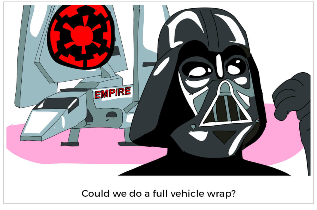
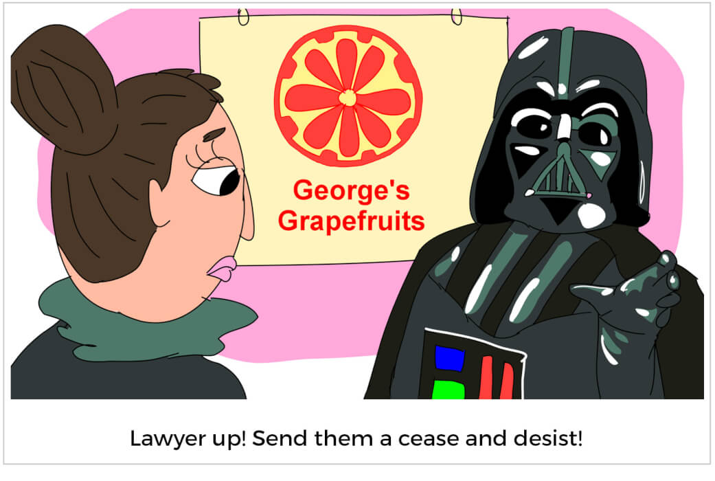
One of the greatest design lessons I’ve learned over the years came from Darth Vader. Think about it: Did George Lucas tell us that Vader was Luke’s father in that famous open crawl? Did we find out thirty minutes into Episode IV? Of course not. We had to wait until the last half hour of Empire to learn the awful truth about Luke’s daddy issues. But that made it all the more memorable—you had to invest time and get to know the characters to really appreciate that particular story arc of the movie.
As a lifelong design nerd, I am usually the last person to downplay the significance of a company’s logo. Logos are incredibly significant, which is why I love designing them. But the meaningfulness a well-made logo needs to deliver simply can’t reveal every single brand detail in one logo mark. While we may think the value of the Nike and Apple logos are solely derived from their design, it’s the billions of dollars and decades of well-crafted brand messaging that greatly affected the way we see these now iconic symbols. I’ve heard a lot of designers describe a logo as an empty vessel, and I think it is a great analogy. While we may want a logo to convey everything about us at one glance, I would argue we should work in the opposite direction.
A logo should be simple and just give the viewer enough information to leave them with an impression of a brand’s personality and a good deal of curiosity. Let the audience build his or her own brand association through real interaction rather than hitting them over the head with what your company/organization is ALL about. It’s always more satisfying and impactful to figure out the plot twist or punch line yourself rather than someone having to explain it to you.
One step in allowing this to happen in a new logo is by managing expectations. If you have a seasoned designer creating a logo for your brand, I recommend doing your best to not judge the logo options for at least 48 hours. It is nearly impossible to see this new design and have it meet the expectations of the time, money and sweat that’s been put into your venture. If it seems weird and unusual, maybe that’s a good thing. It shouldn’t matter if, for example, you don’t like purple or you have an unnatural fear of birds. Listen to the designer’s rationale and look at your competition. It doesn’t have to be your favorite thing personally if it is the perfect vessel for your brand. Try to keep in mind, the end goal is for it to convey the spirit of your company while still being unique and memorable.

So, you have given the new logo time to set in, and it still doesn’t feel right. What’s next?
I would like to take a bit of knowledge from Pixar co-founder Ed Catmull and his book Creativity, Inc. At Pixar, “The Braintrust” is a very candid group of people that review different stages of the production process. One of the only rules is the reviewer just presents the problem and the director finds the solution.
If at this point you have reviewed a logo and feel there is an important part of your company’s essence that isn’t being conveyed in this graphical manifestation, then I have this to suggest…say what is wrong rather than trying to explain how to fix it. Hopefully you hired an agency or designer because of their design and branding excellence. If you see a problem, tell your designer why you aren’t loving the current logo. Then, let the designer work to the find a solution. Most creatives flourish with a challenge more so than direct orders.

We all need to remember that logos, in their purest form, are symbols not stories. If you and your designer find a simple and memorable solution that conveys a general feeling about your brand, then time and experience will turn it into something special…a symbol that represents your story.
We would be wise to approach logo design like George Lucas approached the original trilogy, leaving a little bit of mystery to be discovered. After all, everyone remembers when they uncover an exciting secret.
Check out our nonprofit website and creative services!
