Design WORKS. We know this because of how it makes us feel, but also #science: The human brain processes visual data better than any other type of data, taking in and comprehending images 60,000 times faster than text. And considering 90% of information transmitted to the brain is visual, it’s easy to say good design can make (or break) a message. Print vs. digital design? Doesn’t matter. All design creates brand recognition, builds credibility and uplifts your message to places that words alone can’t achieve.
In today’s world of integrated marketing, the number of channels you have available through which to share your brand and message creates a need for very medium-specific design. That means that the direct mail piece you create needs to be designed much differently than your email newsletter, for example.
We sat down with three of our Firespring designers and chatted about print vs digital design. With expertise in different areas, they shared what it means to design for their particular niche.
Designing for print.
Brophy Ringdahl, Print Designer
Q: What’s the most important thing(s) to keep in mind when designing for print?
BR: Document setup is really top of mind when creating any printed piece. In addition to good design, making sure it’s the right dimensions, folds correctly and allows for proper bleeds are examples of added elements specific to print. Colors are also a big consideration (spot vs. process vs. RGB and knowing when to use them). Image resolution is key as well—using high-quality photos and images is imperative to producing a professional final product and a good impression.
Q: What’s the role strategy plays in print design?
BR: Strategy dictates quite a bit in design. Demographics about who the printed piece is aimed at is a major factor as well as the intended result. Starting the entire design process with those two things in mind allows the design to take shape and the piece to make an impact.
Q: How do you stay on top of current trends?
BR: I follow design blogs and other websites. I also appreciate collaborating with the other Firespring designers and paying attention to what they’re doing.
Q: What are some daily challenges you face when working on print designs?
BR: Although a challenge, I love working with clients who aren’t exactly sure how to explain what they want. It’s my job to work with them and ask the right questions that allow them to express their vision and desired outcome. It isn’t always an easy process, but once we accomplish that together, I’m able to bring that vision to life with just the right style for their brand.

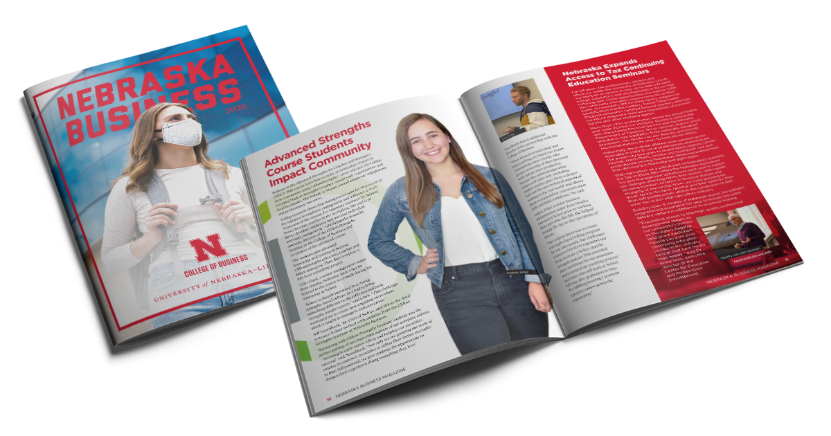
Magazine beautifully designed and printed for UNL College of Business.
Designing for the web.
Dakotah Hicks, Web Designer
Q: Tell me the most important thing you consider when designing for the web?
DH: Because I can’t pick one, I’ll give you two. Always design with mobile in mind. Long gone are the days when a user will only view your website on a tiny Apple Clamshell. It’s my job to design for both beautiful and functional responsive websites. Secondly, designing for accessibility has never been more important. With most of our world communicating over the internet, it’s crucial to make web content more accessible to people with disabilities. Here at Firespring, we design all of our websites to meet the WCAG 2.0 standards.
Q: Let’s talk print vs digital design. What’s the biggest difference?
DH: Right out of the gate, you’re working in a totally different medium. Color space, font types and image resolution needs are different from print to web. Additionally, print design is static and you don’t have to consider how it’s going to shift all over the page as the browser changes size. Print design is often a more final piece whereas websites are living, breathing, constantly changing environments where flexibility is necessary.
Q: What is the process you go through to create your design?
DH: Usually, each project is started with a kickoff meeting to brief us on who the client is and what their goals are. This process includes reviewing client provided assets and walking through the creative brief that provides information on the potential creative direction the client would like to see. I then do some high level research on websites with similar goals and gather inspiration. At this point, I start designing the core UI elements—headlines, body content, buttons, navigation—that will determine the look and feel of the site.
Q: Where do you find inspiration?
DH: Everywhere! Dribble, Behance, CodePen, Codrops, Pinterest, Instagram, scrolling Facebook (sometimes digital ads will spark an idea), tv commercials, and even magazines, posters and billboards. Good design is good design, no matter what the medium is.

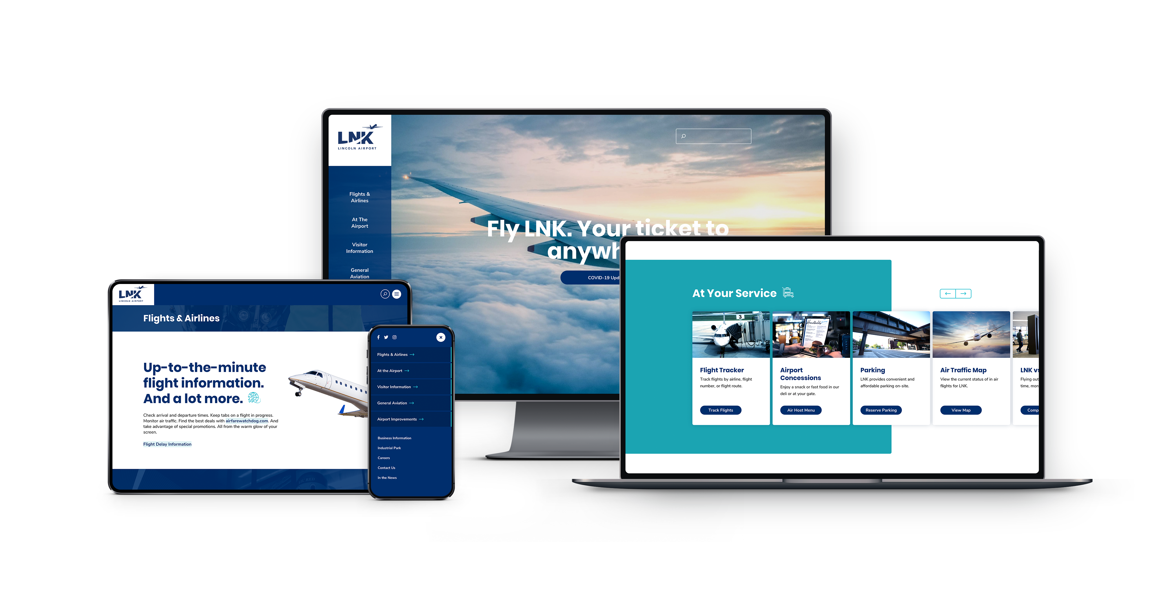
Lincoln Airport designed with modern web standards.
Designing for social media.
Samee Callahan, Social Media Designer
Q: What’s most important to consider when you’re designing for social media?
SC: It’s so important to always design with your target audience in mind. Who are the client’s followers? Who are the types of followers they’re waiting to attract? The difference between getting engagement and not is whether or not you delivered something to your audience that they enjoyed or found useful. Social media is never just one and done, you should constantly be monitoring what works and what doesn’t work and then innovating based on your findings.
Q: What is the process you go through to create your design?
SC: Social media relies heavily on design, strategy and content working hand-in-hand to make a piece that performs well. Once content and strategy are fleshed out, design can begin. Whether it’s for a client I’m familiar with or a new client, I always start by visiting their website and social channels to understand the vibe that they’re trying to convey. I review the brand standards, gather the elements that they want showcased and get to work. I usually start by designing for Instagram because it’s the most versatile platform design-wise. I have to change my approach when I go to Facebook, Twitter and LinkedIn as they have more limited image features so I usually stick to just a single image.
Q: What’s an example of one of your favorite things to design?
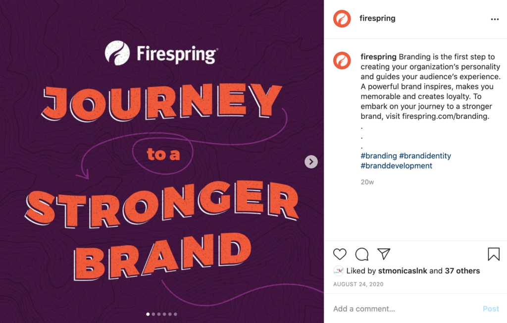
SC: The “Journey to a Stronger Brand” social post was one of my favorite posts to date. We had a strong strategy from the beginning that helped me clearly envision what the audience would want out of a post about branding. By also having the background knowledge of the branding process it helped ensure every part of this post was filled with helpful information. I also love doing a creative flex of joining static imagery with motion design.

Firespring’s social media post designed to engage.
The way Firespring approaches good design is to look at the big picture. If a client comes to us with multi-channel marketing needs, that client gets the benefit of our design experts collaborating to create an engaging, consistent brand experience that sings across all channels.
Looking to explore more of what’s under the hood in our design studio? We’d love to show you.

