If the sincerest form of flattery is imitation, you may want to pay these organizations a compliment. Each of them has a website with elements and features worth borrowing, customizing and implementing on your own. No matter where you are in the process of developing or optimizing your own website–even if you love exactly what you have–there’s always value in seeing how others are using their websites to turn heads and convert; get a donor.
Southwest Wildlife Conservation Center
Who they are: Southwest Wildlife Conservation Center (SWCC) in Scottsdale, Arizona, rescues native wild animals that have lost their homes to development, or are found injured, orphaned or abandoned, fulfilling their mission of “saving our wildlife, one life at a time.” When possible, the animals at the rescue are rehabilitated and released back into the wild. Otherwise, the animals are able to live out their lives at the accredited sanctuary.
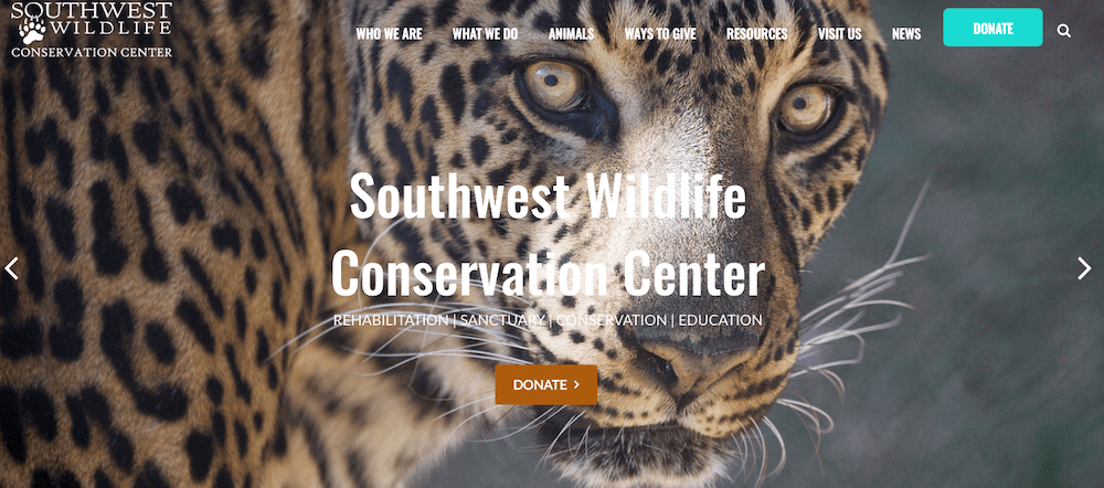
What we love: Their website engages visitors immediately with big, bold, eye-catching images of animals that pull you in, tug at your heartstrings and make you want to give. Their mission is clear and obvious right on their homepage, and their website text is easy to read—but it’s their images and photos that really tell their story and show visitors what they’re about.
What they said: “Like most nonprofits, we receive the majority of our donations at the end of the year. We wanted to change that pattern to one where we receive money that we can depend on each month. Firespring helped make recurring donations a reliable source of monthly income for us. This tool interfaces well with our website, making our online credit card transactions easy for our donors as well as our staff.” —Linda Moore, Assistant Director
Child Care Aware of North Dakota
Who they are: Child Care Aware of North Dakota is a resource site for child care providers who need information and training to operate their business and for families looking for care. They work to build the capacity of child care in North Dakota and ensure that children have the opportunity to play and learn in a safe and healthy environment.
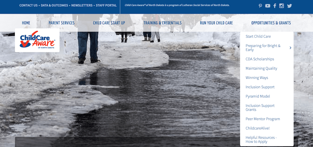
What we love: They have so much information and so many resources to offer through their website—and a wide array of visitors who are all looking for different things—that they needed well-organized, clear navigation to get people to the correct landing page. Their top navigation is impressive, with easy-to-read pull-down menus and well thought out general categories, from Parent Services to Training and Credentials to Opportunities and Grants and more. Also, their top header images are eye-catching and engaging, telling their brand’s story in an attractive, visual way.
What they said: “My favorite part of working with Firespring is the backend content management system. It is intuitive and easy to use. I manage a couple other websites that use another system, and Firespring’s is far superior. Oh, and of course Firespring’s customer service is top notch too.” —Barbara Pates, Communications
National Youth Advocate Program
Who they are: With 65 locations across nine states, National Youth Advocate Program (NYAP) provides opportunities and resources to youth and their families and advocates with public agencies and officials on their behalf. NYAP offers unique and personalized services for families and individuals in four different categories: prevention/intervention, positive youth development, out-of-home-placement and reunification/permanency.
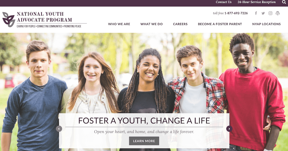
What we love: They offer something for everyone who might be interested in their services right on their homepage. If you’re looking for education or their stance on relevant issues, you can click through to their blog. Want to follow them on social media? Click on their Twitter feed. If you’re ready to become a foster parent, that’s just a click away as well. They’ve done what we encourage all our nonprofit clients to do: Build your website with your end user in mind, not for your staff or employees, but for the people you want to help and serve.
What they said: “We found that by setting our site up through Firespring, we were able to organize all of our various programs and state locations in a way that was very user-friendly and very easy for our visitors to use. Also, another concern was having an easy and effective CMS, and we have found with the content management system that Firespring set up for us, we can easily make changes on the fly and easily train others on my team to make changes as well.” —Jason Zielinski, Communications Director
The Arc Bristol County
Who they are: The Arc of Bristol County offers services and programs for children and adults with challenges throughout Bristol County, Massachusetts, and the State of Rhode Island. For more than 60 years, The Arc of Bristol County has carried out the mission and vision of helping people with intellectual and developmental disabilities, as well as their parents and siblings. They’re committed to helping individuals get the help they need to be fully included in their communities.
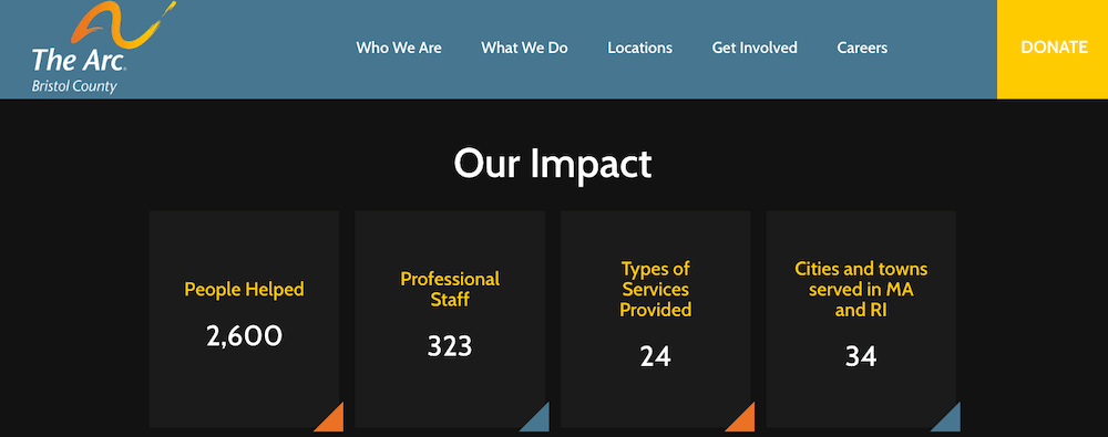
What we love: With big, clear call-to-action buttons right on their homepage, this organization gets visitors right to where they want to go. Get Involved, Donate Now, Upcoming Events, Get Our Newsletter—opportunities to engage are front and center and the navigation is convenient and easy, which leads to a higher conversion rate. Also, be sure to check out the section on their homepage titled Our Impact. It shows at a glance the difference they’re making by telling the story of their impact through numbers.
United Way of West Tennessee
Who they are: With 75 years service, United Way of West Tennessee connects people in need to the resources that can help them and unites people who want to help with the opportunity to do so. They partner with local agencies who are actively meeting the needs of their communities. While they spend the bulk of their time fundraising and investing in their partner agencies, they also offer services like free tax prep and disaster relief.
What we love: Because fundraising is such an integral part of what they do, they need to be sure that when donors come to their site, their donation process is easy, seamless and secure. They feature a bright red Donate button on every single page; no matter which page a visitor navigates to that donation button is in plain sight. Their online donation process is quick and easy without sending the donor to a third-party site. And we love their use of a powerful testimony on their homepage from someone who was served and supported by one of their programs. That’s the stuff that conversions are made of.
If something here caught your eye, we’d love to work with you like we’ve worked with these organizations and others for over 20 years. We consider the nonprofit space our home and helping organizations like yours our passion.
Our mission is to help you accomplish yours. Learn more about Firespring’s nonprofit websites. Or for a more detailed look at what we can do for you, watch An Inside Look into Firepring’s Nonprofit Websites video on demand.

