On your website, landing pages are where the action happens—at least, that’s the goal. Good landing pages can make your website a converting machine. If it’s designed well, users will know exactly what you want them to do within five seconds—and they’ll be more likely to do it.
But let’s start at the beginning before we get too in the weeds about conversion, so we know we’re all on the same page.
What are landing pages?
Understanding the difference between landing pages and homepages is one of the keys to better marketing results.
Homepages are like the front door to your organization on the web. They’re essential for cultivating your first impression, conveying big-picture information (like your mission) and directing traffic between different parts of your website, such as your donor page or events calendar. You send people to your homepage when you want to introduce them to who you are.
Landing pages, on the other hand, are specialized marketing tools created with a specific purpose: to encourage people to act. They’re where calls to action in your marketing materials—a Learn More button on a digital ad, a QR code on a direct mailer or a link in a social media post, for example—come alive and result in conversions.
Landing pages are ideal because they can be built around a clear and direct purpose, then tailored with supporting visuals, copy and functionality to drive home your message. Imagine a donations page containing compelling photos, your latest video and client testimonials alongside a digital payment form.
Here are five typical purposes for a landing page:
- Get a visitor to click to another page on your website (or someone else’s).
- Get a customer to make a purchase or donation.
- Get a prospect to give permission for you to follow up by email, phone, etc.
- Get a follower or fan to share or tell a friend.
- Get an interested party to learn something.
Why do we need landing pages?
Why not just send people to your homepage? Because when it comes to obeying calls to action, people have limited patience and short attention spans.
A lot of brands and businesses lead people to their website’s homepage instead of a specific landing page—but that’s like the difference between driving someone to a general neighborhood (and making them find the right address) and Ubering them right to someone’s front door. It’s a lot easier on your rider (er, online visitor) to get them right where you want them rather than asking them to navigate around themselves.
If you want someone to perform a task—say, make a donation—your best bet is to make sure it’s easy to do while eliminating competing distractions. For example, instead of making users click to your homepage then navigate to your donations page, why not send them straight to a donor landing page designed with the engaging elements and payment option we discussed earlier?
This specificity and customization are why landing pages are powerful marketing tools that are proven to increase conversion rates; they’re straight-up terrific at promoting clear calls to action. For example, Hubspot found that among forms of marketing, landing pages had the highest conversion rates for lead generation since they were so effective at getting people to enter their contact information.
To get you the results you want, include these five important landing page design elements:
1. A clear and engaging headline
This should tell the user what the page is about in a concise but compelling way. It’s also a good idea to complement the text that brought the user to that particular page so there’s a seamless flow and familiarity.
When someone clicks on an ad, an email or any other link to get to your landing page, it’s best if the message and language in both places match. (Close is good, exact is best.) This way, they won’t pack up and go home before they even look around. Consistency is key to creating a good user experience. You want to build a seamless flow from point A to point B.
2. A brief but descriptive subhead explaining the page’s purpose
Here’s where you can give visitors details about why they’re there and what you want them to do. It’s not necessary to write paragraphs; people won’t read it all. But you do want to be engaging and provide clarity and direction.
People don’t typically read word for word on the web; they like to scan. Use bullet points to drive your main message home with easy-to-read, clear language. If you feel like long copy is necessary, make it obvious that people can and should scroll down—and encourage them to do so. But for best results, use text that quickly describes the action that you want your visitor to take on that page.
3. A clear call to action with a prominent button
Your goal for this page is conversion—you want visitors to click that button. Make your call-to-action specific (Buy Now or Sign Up rather than just Submit) and design the button so it can’t be missed (big, colorful, surrounded by plenty of white space). Be specific about what you want your visitors to do, keep the text short and choose active words.
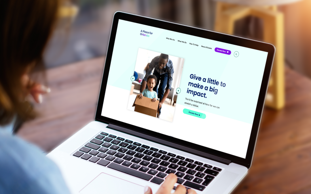
4. Compelling images that help tell your story and tug at heartstrings
Don’t leave the heavy lifting to the text; images and videos that evoke emotion and draw a user into the page speak louder than words, so choose wisely. Remember to marry the image with the text—together they should clearly tell your story and explain the course of action you want someone to take.
Nonprofits: As nice as your mission statement is, it’s typically not going to be the thing that gets a prospective donor over the finish line. This old adage remains true: A picture is worth a thousand words. And on your landing page, it may well be worth a new donor.
5. Influential testimonials
Nothing speaks louder than comments and reviews from satisfied customers or happy donors. Third-party credibility can help boost conversions. Integrate quotes from social media, testimonials and data into your landing page (e.g., “2K people have already downloaded this eBook.”) to make your business or organization even more trustworthy.
One last thing to mention: Eliminate all top navigation from your landing pages. This keeps your user on the page and the focus on the call to action. Your single goal on any particular landing page is to get them to click on that button. You can provide options for navigating to other pages later.
Make your landing pages work for you
Landing pages are the gateway to your website. All the different touch points you have with your audience, whether it’s through email marketing, social media, direct mail pieces or other marketing tools, should get people right where you want them and motivate them to engage, whether it’s to make a purchase, register for an event or sign up for emails.
Need assistance in creating pages that get the job done? You’ve “landed” in the right spot—let’s connect here where you can drop some details about how we can help.